Project 2021
Guideline for Mobile Forms

Feature Summary
In an era when mobile traffic to websites is rapidly increasing, it's imperative to reduce friction for visitors to convert.
Think back to the last time you purchased a ticket, booked a hotel, or made a purchase online. Most likely, you filled out a form during those interactions.
The completion of forms often produces friction and frustrates users to the point where they abandon. During peak sales periods, it's critical that your users either convert directly into sales or turn into micro-conversions that can be used later.
Using forms effectively is not just about using them. It is about ensuringthat they are completed quickly and without confusion. In this article, you can learn practical techniques that will help you to create effective forms.
My Role
Responsible for redesign, discovery and ideation, interaction design, affinity Mapping, wireframes and prototype.
Tools
Figma, Principle, Protopie
Challenges Faced
Mobile form design strategies can be more of a challenge than desktop for a number of reasons:
-
With smartphones having smaller screens, it's more challenging to design forms and adds key features like explanations.
-
Touch inputs can be less precise and more likely to produce errors from users.
-
Mobiles are often used in transit, or in situations where the user is hurried or cannot give forms their full attention.
-
Variable mobile internet connections can make form filling more difficult.
Why People Abandon Online Forms
Mobile form design strategies can be more of a challenge than desktop for a number of reasons:
-
The majority of people (81%) have abandoned an online form after beginning to fill it out.
-
Security concerns are the top deterrent preventing users from completing online forms, with 29% opting for abandonment.
-
Form length is the second reason for online form abandonment: More than a quarter (27%) of users abandon an online form because it is too long.
-
If someone abandons an online form, they are unlikely to return. More than half (67%) of users opt to abandon the process entirely if complications arise, compared to only 20% who follow up with the company in some way.
-
When people return to complete an online form, it’s mostly for self-motivated reasons such as needing access to a resource (30%) or wanting to redeem an incentive (20%).
-
Another 19% return to complete an online form if the company initiates additional contact through an email or phone call.
-
After completing an online form, companies are most likely to send a receipt (44%), email verification (38%), and/or promotional emails (22%).
-
Only 3% of people prefer to fill out online forms on a mobile device, compared to 84% who prefer a laptop or desktop computer and 13% who prefer a physical copy.
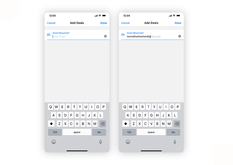
1. Clearly distinguish all Mandatory fields
Avoid using the asterisk (*) to mean “required.” Not all users will associate the asterisk with required/mandatory information. Use the “Required” label to denote mandatory fields

2. Use Placeholder and Masked Input
The problem of format uncertainty is one of the most significant problems of form design when users are unsure of the format in which they should provide their data, they can abandon the form very quickly.
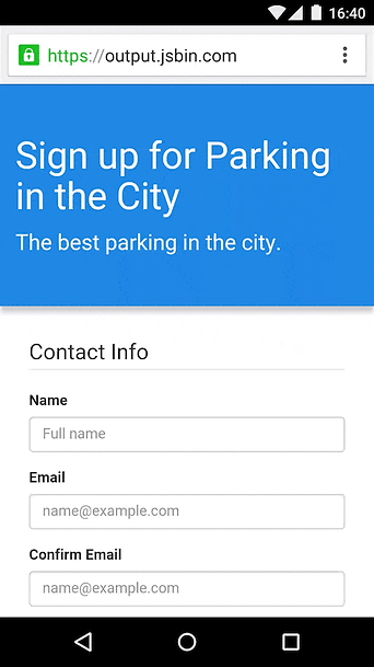
Placeholders
Placing placeholder text in input fields can indicate what content is expected. Placeholder text isn't necessary for simple fields such as "Full name", but it will be extremely useful when the field requires data to be entered. The placeholder text on your form must be clearly distinguished from the real value entered by the user. In other words, placeholder text should not resemble the preset value. In the absence of distinct visual distinction, users may think that these fields already contain values.

Masked Input
It is a technique that helps users format inputted text. Some designers confuse field masking with placeholder text. Unlike placeholders, which are static, masks automatically format any input from the user. Masked input also makes it easy for users to validate the information. When a phone number is displayed in chunks, it makes it easier to find and correct a typo.

3. Automate
Optimizing data input does not just mean minimizing the number of input fields - you need to consider the amount of user effort required. By reducing unnecessary typing, we will increase our customers' satisfaction and decrease their error rates.
Autocomplete
Users experience autocompletion when typing a question in Google's search box. Google provides users with a list of suggestions based on what the user has typed. The same idea can be applied to form design. For example, a form could autocomplete an email address.
Autocapitalize
Using autocapitalizing automatically makes the first letter of a field a capital. In password fields, you should avoid the feature.
Autocorrect
The autocorrect feature corrects words that appear misspelled. This feature can be turned off for fields that are unique, like names or addresses.
Auto-Fill
Filling out the address part of an online signup form is often the most complicated part. Use your browser's autofill function to fill out the address field automatically. According to Google research, autofill helps people fill out forms 30% faster.
Location Services
Using a geolocation API, one can choose a user's country. However,prefilling the full address is often problematic due to accuracy issues. Google Places API provides a solution for this. It provides accurate suggestions based on both geolocation andaddress prefilling.

4. Field Labels
Input labels provide information about the type of data expected from users in a particular field. Accordingly, clearly written labels make formsmore accessible. Labels should help the user understand what information is required at a glance.
Labels are not help-text. Use succinct, crisp labels (one or two words) so that users can quickly scan the form.

Dont use disappearing placeholders text as labels. It is easy to avoid disappearing placeholders by using floating (or adaptive) labels. After the user taps on the field with a label placeholder, the label doesn't disappear, it moves to the top of the field so the user can enter their data.
5. Provide Correct Keyboard
It is a great idea for your app or website to provide their users with an appropriate keyboard because this prevents them from performingadditional actions. As an example, if your app requires users to enter a credit card number, it should only show the dial pad

6. Single Column Layout
This approach is generally preferred for both mobile and desktop forms, but it is especially useful for smaller screens. Single column layouts are easier to read when users are able to focus on one column at a time. They also appear cleaner and less intimidating for customers.
